
FEATURED WORK


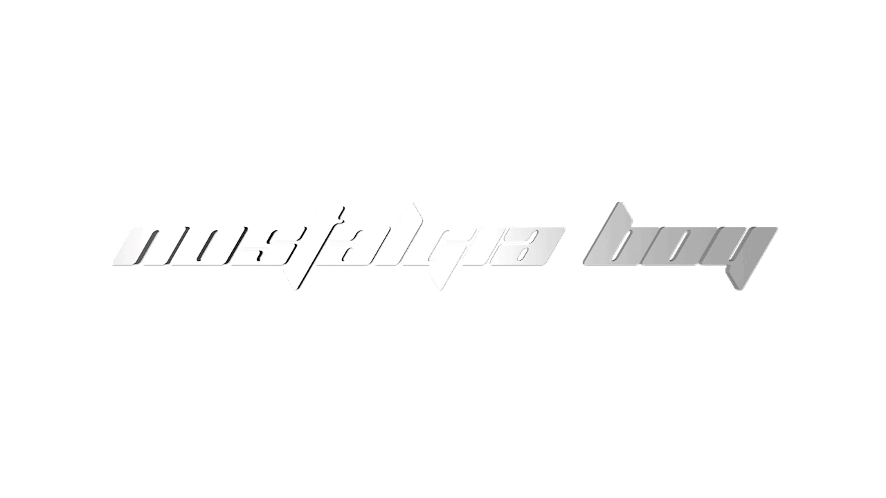


NOSTALGIA BOY
Nostalgia Boy is a multimedia digital experience in the form of concept brand and net art website. The website design, as well as the physical merchandise on display is based on characters and lore created in reference to the intense nostalgia for video games, toys, and cartoons during the early-mid 2000s. I hope that as people navigate through the space, and interact with the website itself, they will begin to think more thoughtfully about the current state of the Internet, and technology as a whole in today’s society. The piece is not only a nod to the memories I cherish most from my childhood, but also a reference to the culture that has surrounded collecting memorabilia from the past. Nostalgia Boy also serves as a commentary on this culture and the way that commercial industries have capitalized on nostalgia to the point where life has been nearly stripped out of it completely.


POETRY CLUB: Poetry Night + Zine
As the Public Relations Chair of the Poetry Club at Stevens Institute of Technology, it is my job to design and create all of the branding, logos, posters, and social media content for the club. Each semester, we host an open mic night which consists of tons of poetry readings, some live music performances, and a themed Zine which we create as a club each semester.
Generally, we like to keep the spreads open for our club members to do with them what they which, however, for the Fall 2018 issue, we decided to go with a consistent color pallet and typeface. We settled on Helvetica Neue and Black, White, and RGB Blue. I then took some time thinking about how I wanted the entire Zine to look. I first made my spread, then focused on applying that art style to the cover spread for the zine, as well as the promotional poster for the Poetry Night.
The style I chose to use for all of the visual content was a combination of typography, digital, and hand drawn illustrations. The fusion of digital and physical art was a concept I focused on a lot during the fall 2018 semester. I created a digital spread for the front and back cover of the zine, and printed it out. I then got some of our members to make illustrations on the cover with a fine tip marker and copied the images into illustrator. The cover and promotional poster are inspired by MTA and NJ Transit date visualizations and informational images.


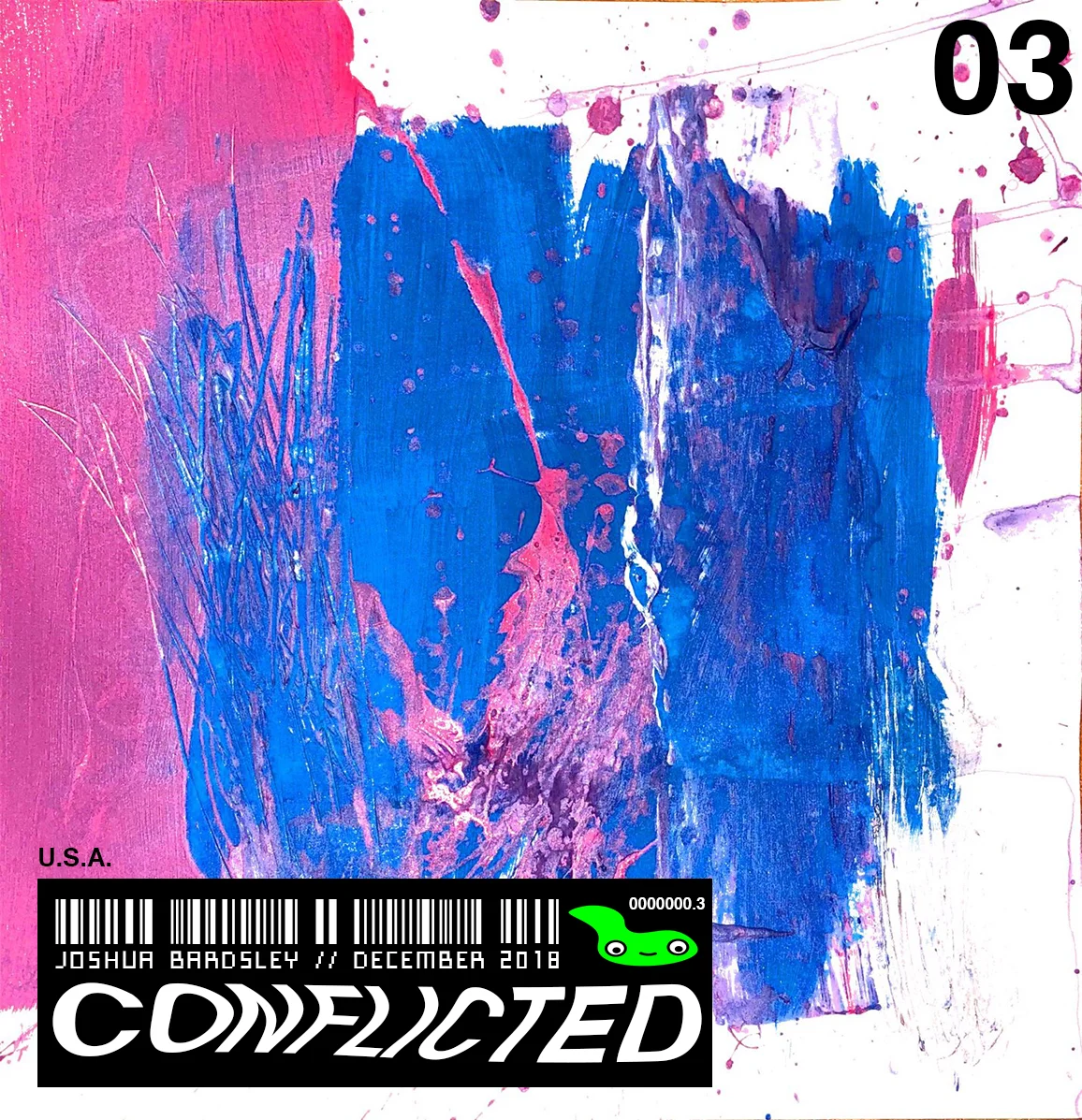
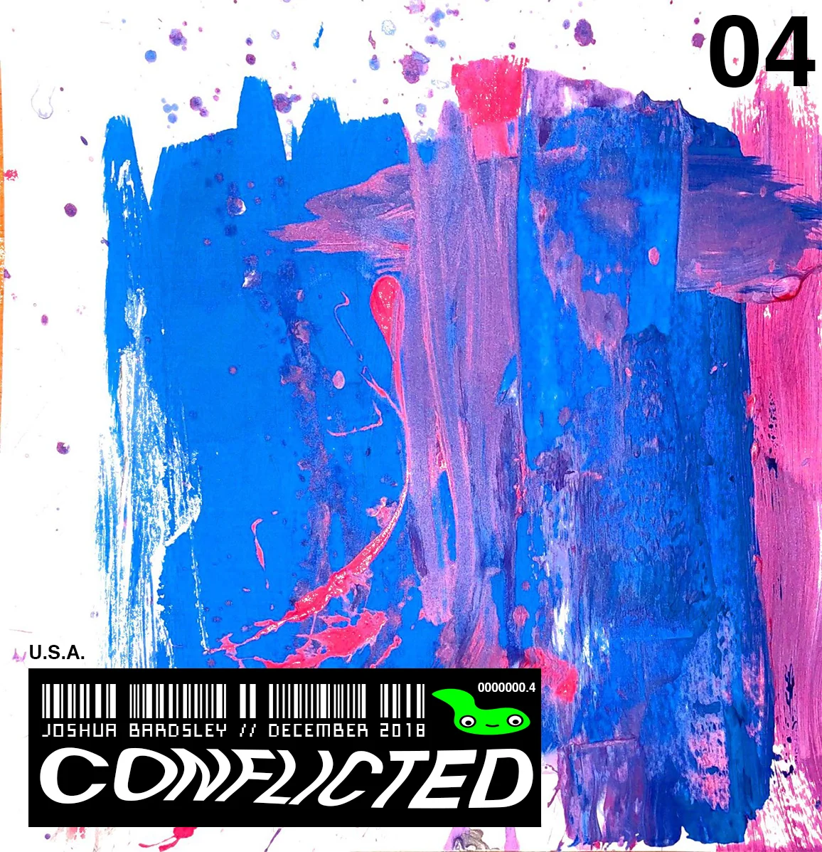
Conflicted
Conflicted was a 2D project. The project required us to make a physical piece of art, scan it, and shrink it down to become a stamp sized image.I immediately knew i wanted to do something that involved the combination of physical and digital art, because it’s something i’ve always wanted to try. One challenge that I ran into while working on this project was i realized that the scanner i was planning on using was not big enough to fit my paintings, so I had to use a scanner app, which kind of distorted the colors, but i ended up just going with it. During the course of this project, I learned that I really liked the result of combining digital and physical artwork, and that it might be a style i’d like to pursue in the future.
Ageism Projects
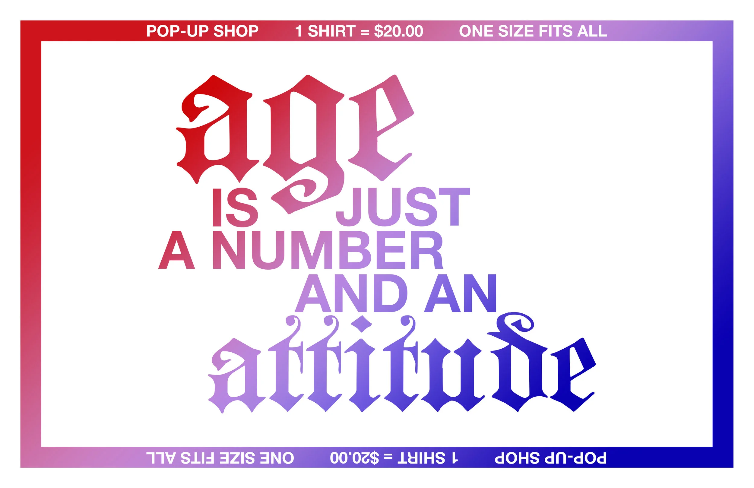
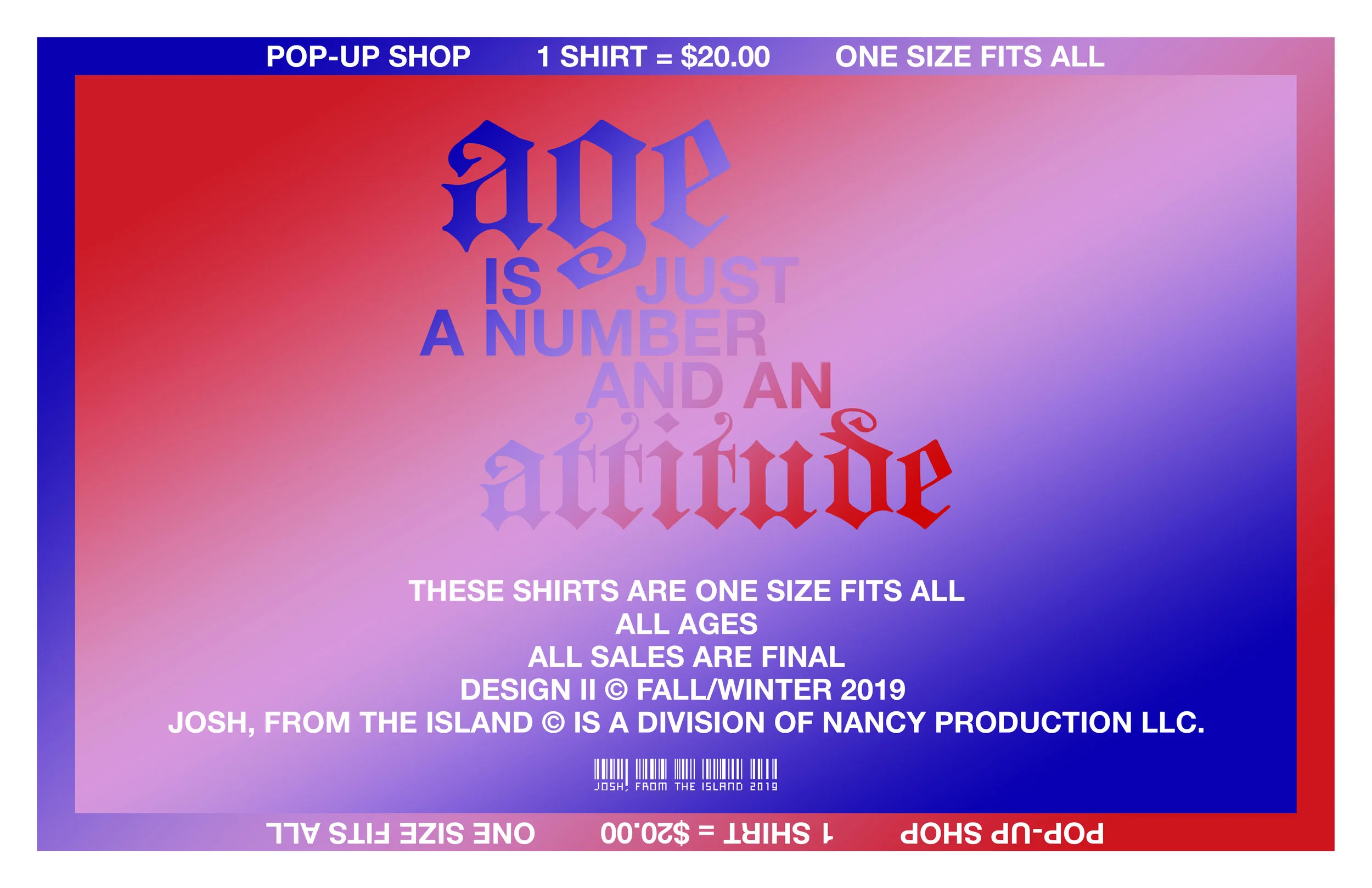

AGEISM: Pop-Up Shop
The “Ageism Pop-Up Shop” was an idea I had inspired by the idea of ONE SIZE FITS ALL. Can one size actually fit all? The point was to create a mobile station where I could sell merchandise that could be appealing to people of any age or gender.
To create the shirts, I made a stencil out of chipboard using a laser cutter, and then spray painted the graphic onto size XL Gildan blank white t-shirts. It is humourous to see people of all different ages, sizes, and genders wearing the shirts, because some of them just do not fit, but that’s the point isn’t it?
The type face is made out of Helvetica Bold and Blackletter. The purpose of this was to create a balance of age. Blackletter is arguably the oldest typeface in existence, whereas Helvetica Bold is used very commonly in modern graphic design. The colors are also a play on timelessness.
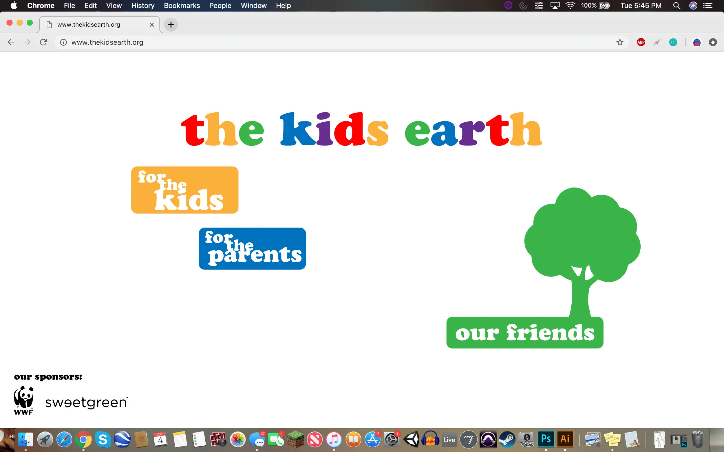
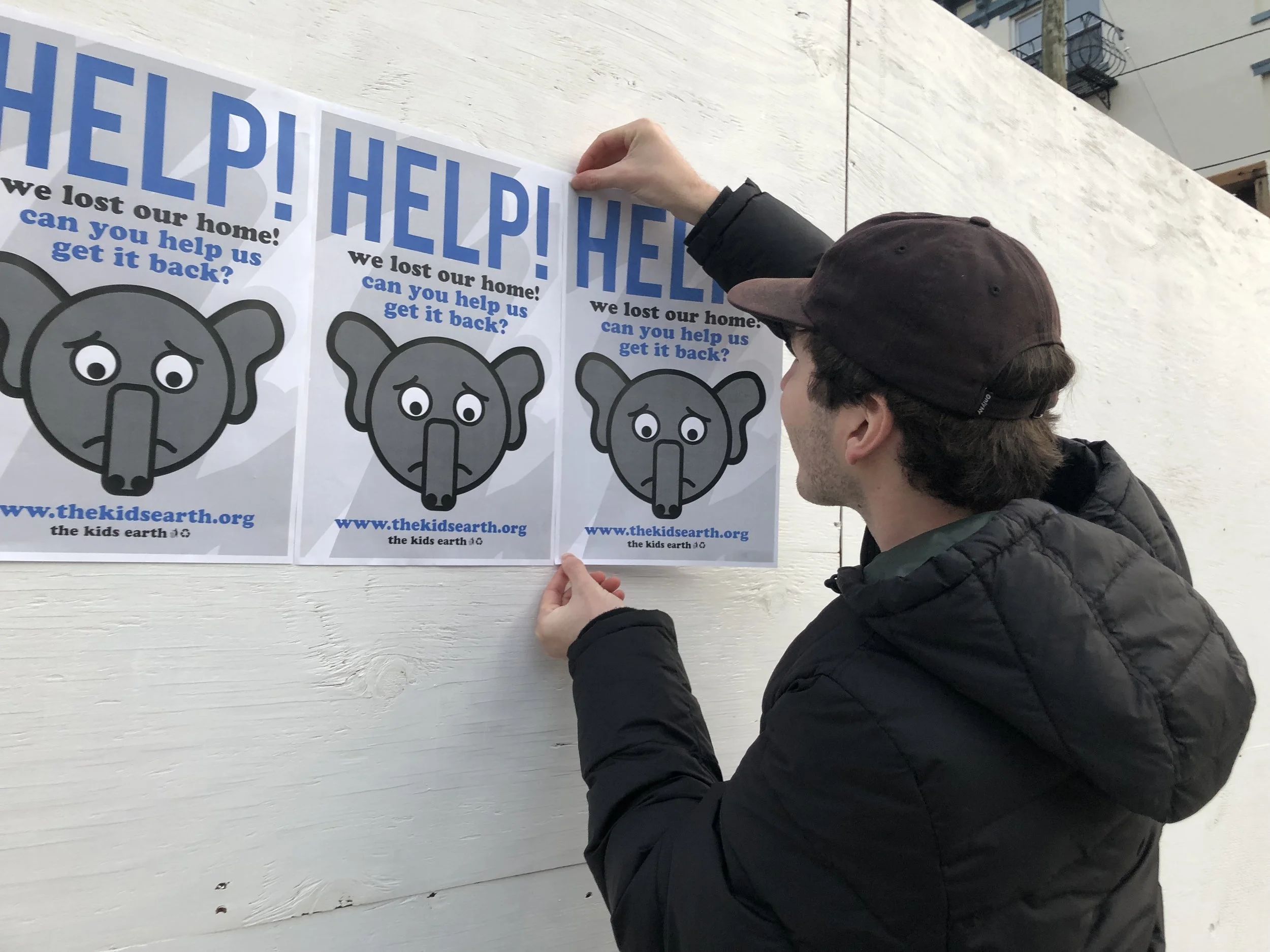

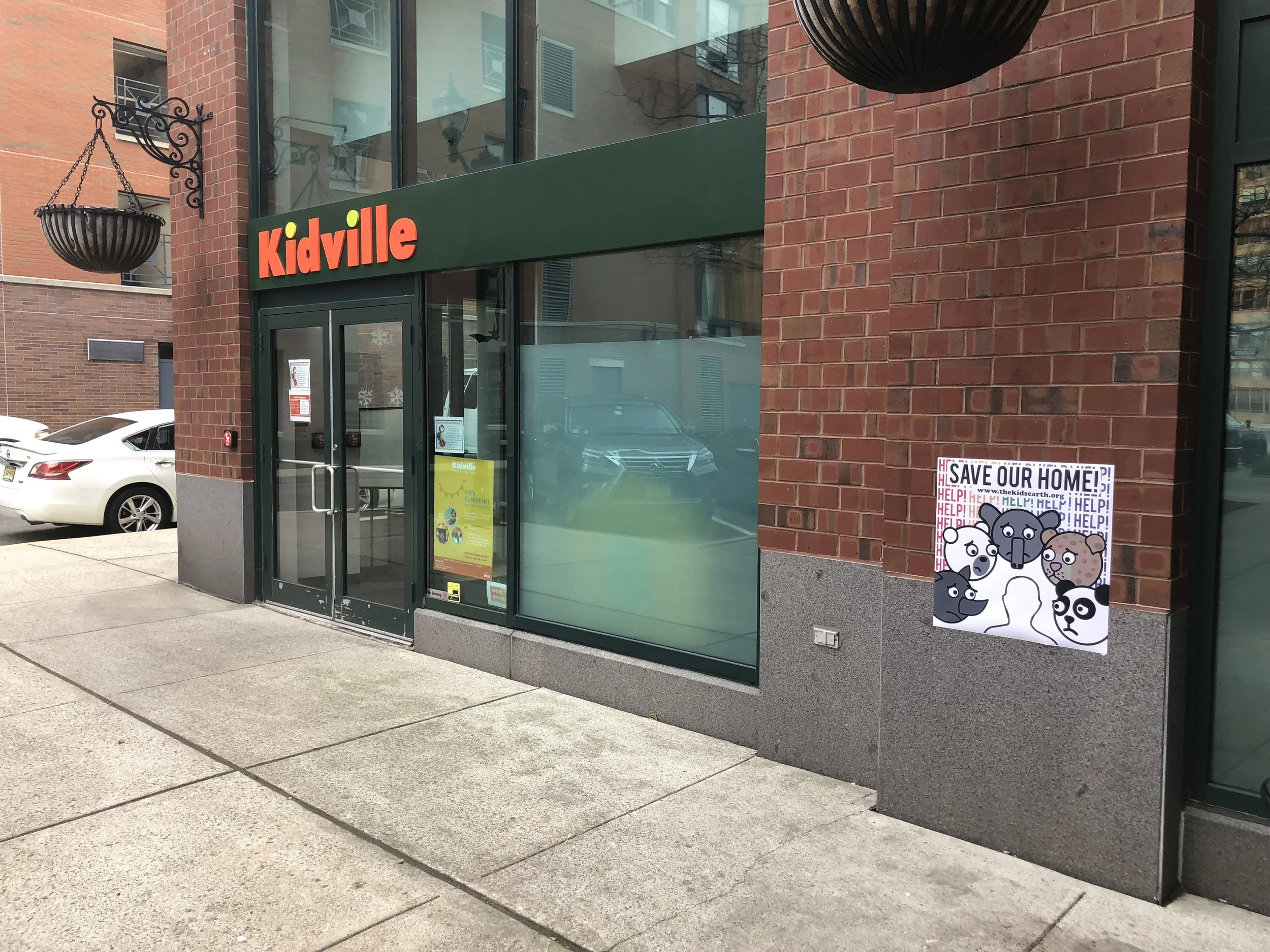
The Kids Earth
For this project, I was challenged with the task of creating a climate change campaign based around three touchpoints in promotion of the campaign. I decided early on that i wanted to do my campaign on endangered animals. My early stages of the project were spent conducting research. My research was mainly centered around design techniques for brands directed at children. I wanted to market my campaign towards children because they are the generations who will really be making or breaking the health of our planet in the near future.
One of the most impactful concepts I discovered in my research was how cereal brands, whose mascots are marketed towards children, are designed so that their eyes are always looking down towards the children who would be walking by, below the shelves in the supermarket. That subtle design technique makes a lasting impact on kids who end up making eye contact with the cute and cuddly characters they have grown to love. This is what I wanted to implement into my designs.


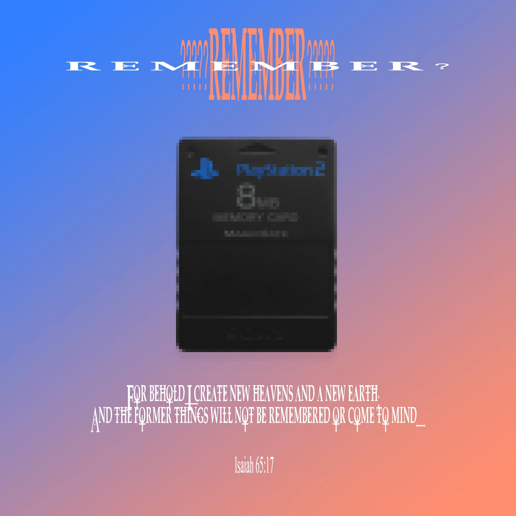
four.one (GOD)
four.one (GOD) is a four piece digital art set I created during Spring 2018. The piece was inspired by four different Bible verses, as well as imagery used by Playstations’ PS2 console. The title of each piece represents the bible verse displayed, as well as the manipulation to the Playstation in each image.

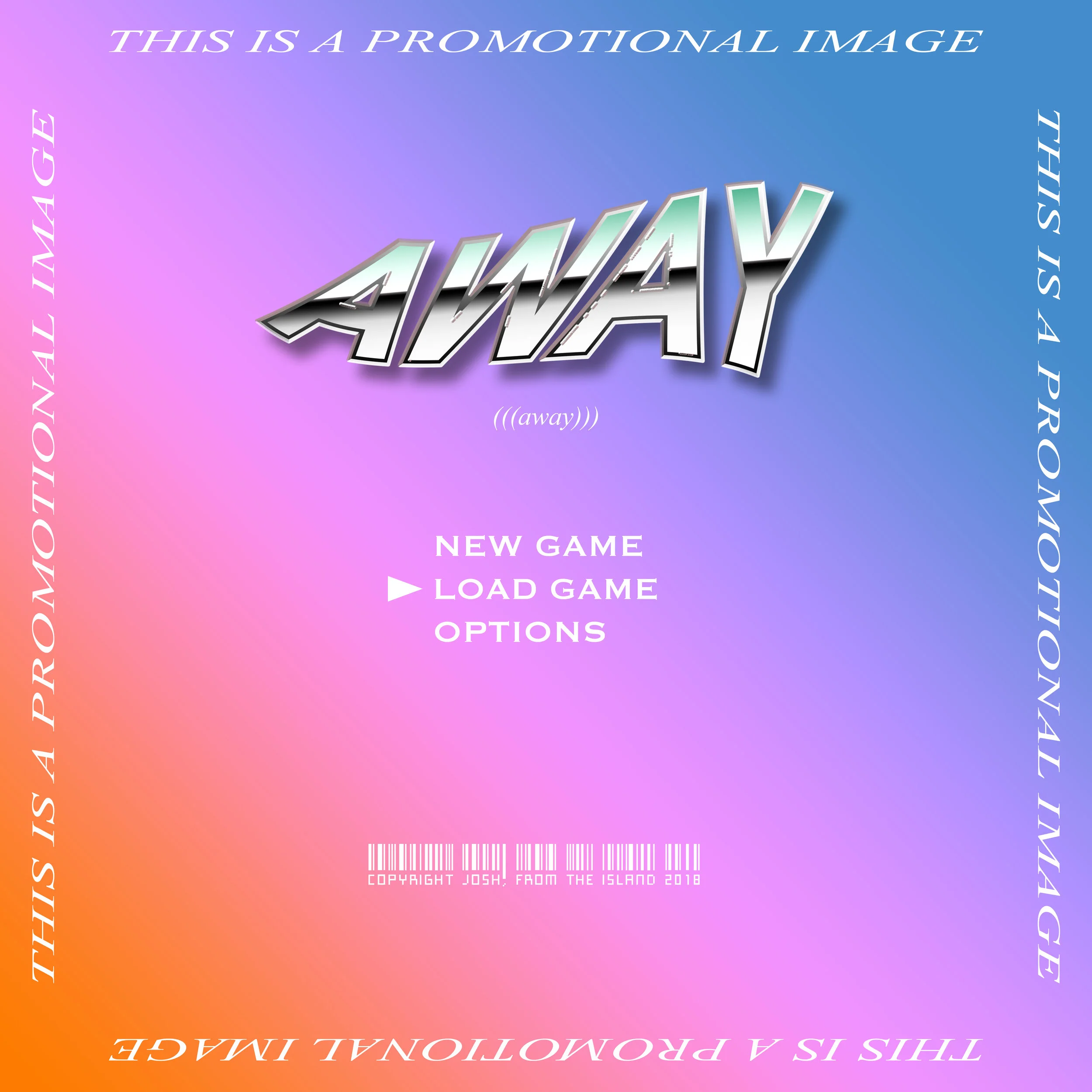
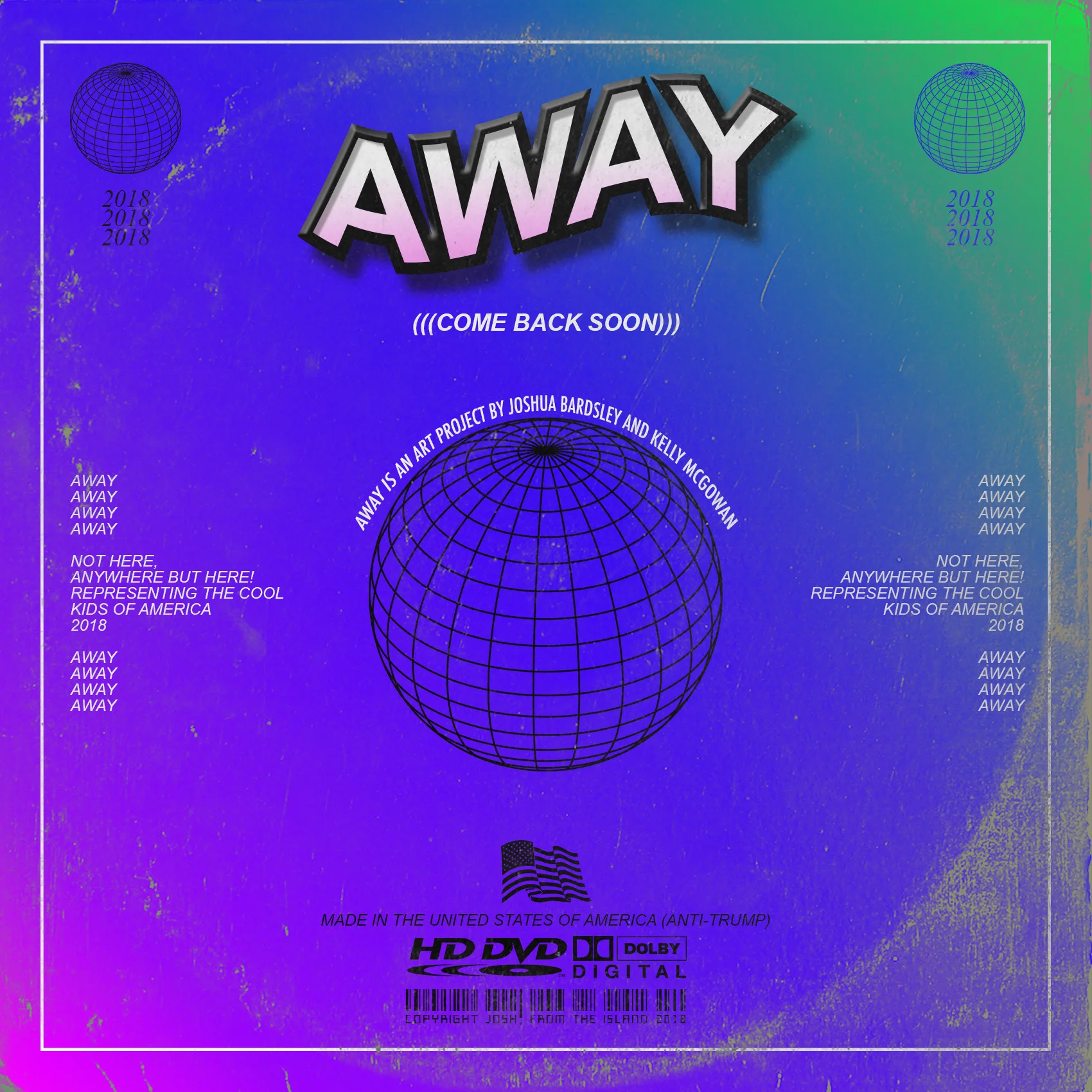
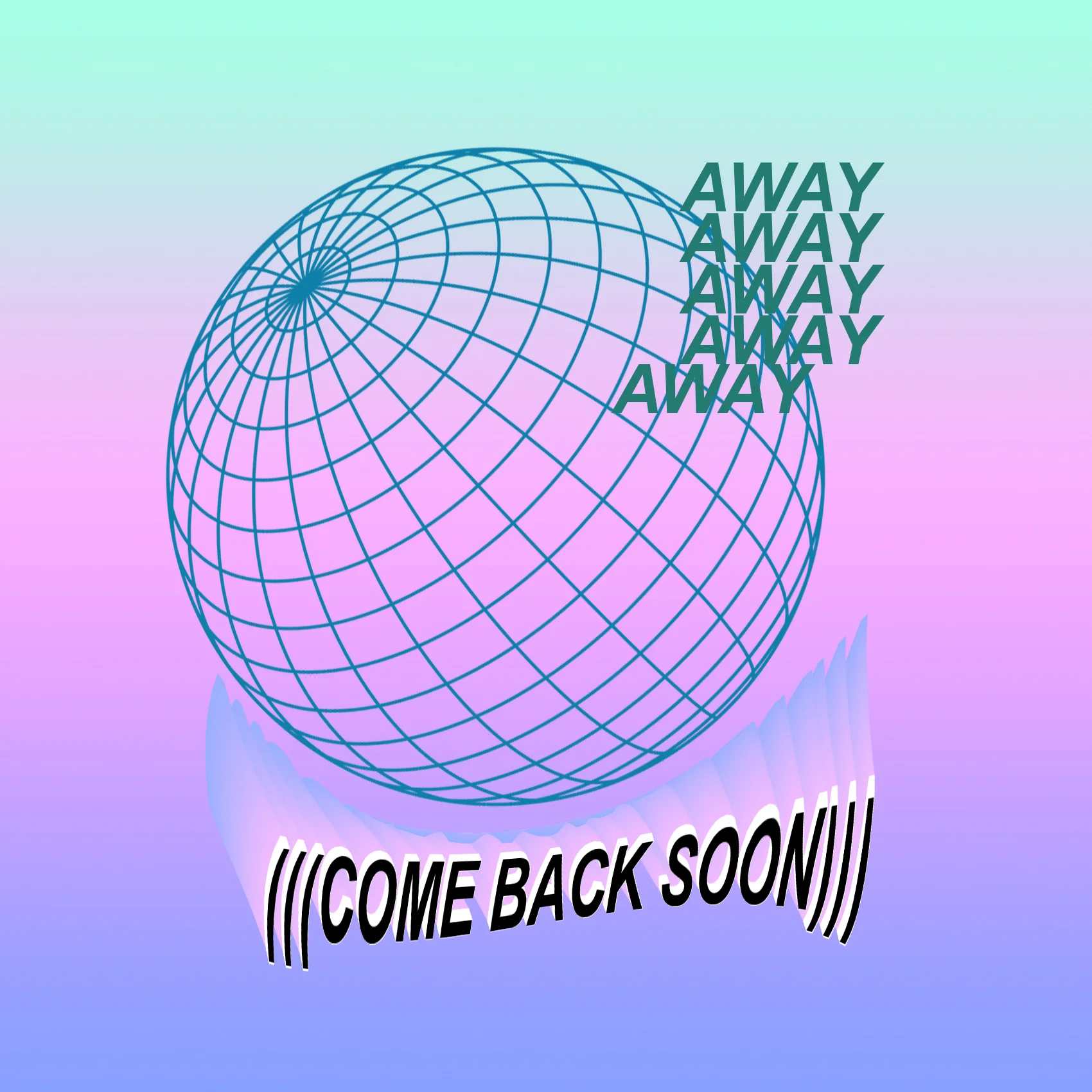
AWAY
Away was a concept design project. Much of the imagery created was specifically for large scale print (logos, posters, album art, etc.), and the actual game development was not intended to be done. Typography and graphical composition were the main practice with this project.